One of the first questions in any commission is which medium to use. Clients sometimes expect me to answer with a matter of taste. Usually the answer comes from somewhere more practical: where the image will be printed, how big it will be, and whether color is part of the information.
Pen and ink and watercolor sit at opposite ends of traditional scientific illustration. One is pure black line on white. The other is transparent color built up in layers. Both have been used to describe plants and animals for centuries, and both are still useful today, often in combination with digital finishing. Here is how they differ and how I decide between them.
Pen and ink: information in black and white
Ink drawing has no gray. Every tone has to be built from black marks on white paper, using a few standard techniques:
- Line for outlines and structure, with heavier lines on the shadow side to suggest form.
- Hatching and cross-hatching, parallel or crossing lines that read as tone from a distance.
- Stipple, tone made entirely of dots: sparse dots for light areas, dense dots for shadow. It is slow, but it describes surfaces such as shells, bone, seeds and pottery beautifully, and it survives reduction well.
Illustrators work with technical pens or pigment fineliners for even lines, and dip pens with fine nibs when they want lines that swell and taper. The surface matters too. Smooth Bristol board or drafting film keeps edges crisp, and on film a mistake can be scraped away with a blade.
The great strength of ink is reproduction. A black line prints sharply in one color, at small sizes, on inexpensive paper, and it still reads after it has been photocopied for a classroom. That is why ink line remains standard in taxonomic papers, identification keys, archaeological artifact drawings and worksheets students label themselves.
Watercolor: color as information
Watercolor is transparent. Light passes through the paint, reflects off the paper and comes back through the layers, which gives the luminous quality that makes it so well suited to petals, wet skin and wings. The paper is the lightest value in the picture, so highlights are planned from the start and kept clean rather than added at the end.
For detailed natural history work, illustrators usually choose smooth hot-press watercolor paper, which holds fine brushwork, rather than textured cold-press paper. A plate is built in thin layers: a light wash for the overall color, then gradually darker layers for form, then fine detail with a small brush.
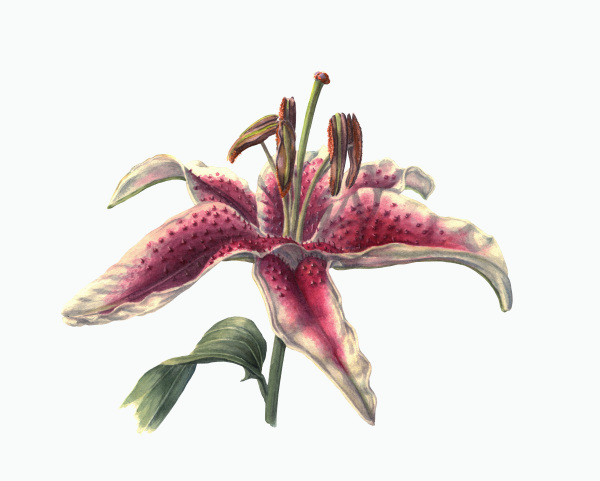
Watercolor earns its place whenever color helps identify or explain the subject: the spotting on a lily, the exact blue of a poison dart frog, the color change in a ripening fruit. It is less forgiving than ink. Some paint can be lifted, but a heavy mistake usually means starting again, and color has to be checked carefully through scanning and proofing so the printed image matches the original.
Side by side
| Question | Pen and ink | Watercolor |
|---|---|---|
| What it shows best | Structure, outline, texture, counts and proportions | Color, subtle gradation, translucency, surface sheen |
| Printing | One color; cheap to print; survives photocopying | Needs full-color printing and careful color proofing |
| Small sizes | Excellent, if line weights are planned for the reduction | Fine detail can soften when reduced |
| Corrections | Possible on film or after scanning | Limited; large changes often mean repainting |
| Labels | Sit cleanly next to line art | Need space planned so they do not fight the color |
| Typical uses | Journals, keys, field guide line figures, artifact drawings, worksheets | Botanical plates, species portraits, posters, covers, exhibit panels |
One subject, two treatments
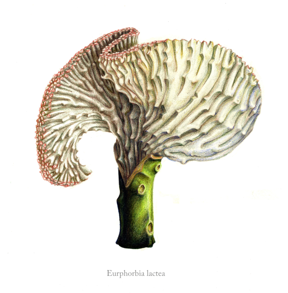
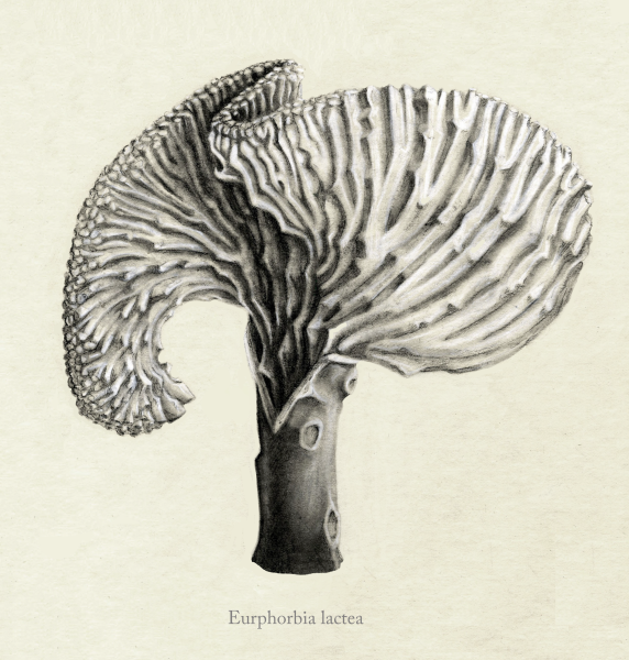
My drawings of Euphorbia lactea show how much the decision changes an image. The plant is a crested form, with a fan of rippled tissue growing from the top of a green stem. In the color version, the green stem and the reddish edge of the crest tell you what the plant looks like in a pot on a windowsill. In the black-and-white version there is no color to lean on, so the ridges, the shadow inside the fold and the scars on the stem carry the whole image, and the structure of the crest is easier to read.
How I choose: five questions
- Will it be printed in color? If the publication is black and white, ink or tonal graphite is the honest choice. A color painting converted to grayscale rarely looks as good as art made for black and white.
- How big will it appear? A figure printed a few centimeters wide in a journal needs bold, simple line work. A poster or exhibit panel can carry the subtle layers of watercolor.
- Is color part of the identification? For many flowers, birds, frogs and insects, it is. For bones, shells, seeds and fossils, structure usually matters more.
- Will people copy or label it? Teaching materials are photocopied and written on. Clean ink line, like the line art I prepare for life cycle diagrams, holds up best.
- How likely are changes? If the content is still being reviewed, a medium that is easy to correct, or a digital finish, saves time and money for everyone. Medium is one of the factors I explain in How Much Does Scientific Illustration Cost?
You don't always have to choose
Many good illustrations combine media. Ink line with a light watercolor wash is a classic for field sketches, and I use it in my own field journals. Graphite gives soft tone without color, as in my reconstruction of the Kolb site. Colored pencil can be layered over watercolor for fine texture. And much publication work today starts by hand and finishes digitally, so labels, corrections and resizing stay flexible.
If you are planning a book, plate or panel and are not sure which medium suits it, tell me where it will be used and I will suggest one. You can read more about commissioning plant work on my botanical illustration commissions page, or contact me directly.